CSS Box Model

Box Model 개념


모든 HTML 요소는 Box 형태의 영역(사각형)을 가지고 있다.

Box는 Content, Padding, Border, Margin으로 구성되어있다.

CSS Box Model


box-sizing 프로퍼티


CSS에는 box-sizing라는 프로퍼티가 있고, 키워드로는 content-box와 border-box가 있다. 기본값(default)은 content-box로 되어있는데, 이는 width, height 프로퍼티 값이 content 영역을 의미한다.

만약, border-box를 사용하면 width, height 프로퍼티 값은 content + padding + border의 총합 영역을 의미한다.

[1] 두개의 div 박스를 만들어보자.

1
2
3
4
5
6
7
8
9
10
11
12
13
14
15
16
17
18
19
20
21
22
23
24
25
26
27
28
29
import React from "react";
import "./App.css";


const simpleStyle = {
width: "500px",
margin: "20px auto",
border: "solid red 2px"
};
const fancyStyle = {
width: "500px",
margin: "20px auto",
border: "solid blue 2px"
};

function App() {
return (
<div>
<div className="simple" style={simpleStyle}>
simple
</div>
<div className="fancy" style={fancyStyle}>
fancy
</div>
</div>
);
}

export default App;

그러면, 두 div의 박스는 다음과 같다.

두개의 div


[2] padding을 추가해보자.

1
2
3
4
5
6
7
8
9
10
11
12
13
14
15
16
17
18
19
20
21
22
23
24
25
26
27
28
29
30
import React from "react";
import "./App.css";


const simpleStyle = {
width: "500px",
margin: "20px auto",
border: "solid red 2px"
};
const fancyStyle = {
width: "500px",
margin: "20px auto",
border: "solid blue 2px",
padding: "50px" // padding 추가
};

function App() {
return (
<div>
<div className="simple" style={simpleStyle}>
simple
</div>
<div className="fancy" style={fancyStyle}>
fancy
</div>
</div>
);
}

export default App;

그러면, 두 div의 박스는 다음과 같다.

box-sizing: content-box

이렇게 되는 이유가, default로 box-sizing이 content-box이기 때문에, width의 기준은 content 영역이다. 즉, box 구성의 다른부분, 예를 들어 padding이 추가되면 박스의 전체적인 모양은 늘어난다.

이를 방지하기 위해서는 box-sizing의 값을 border-box로 지정해야 한다.

[3] box-sizing의 값을 border-box로 지정

1
2
3
4
5
6
7
8
9
10
11
12
13
14
15
16
17
18
19
20
21
22
23
24
25
26
27
28
29
30
31
import React from "react";
import "./App.css";


const simpleStyle = {
width: "500px",
margin: "20px auto",
border: "solid red 2px"
};
const fancyStyle = {
boxSizing: "border-box", // border-box 지정
width: "500px",
margin: "20px auto",
border: "solid blue 2px",
padding: "50px"
};

function App() {
return (
<div>
<div className="simple" style={simpleStyle}>
simple
</div>
<div className="fancy" style={fancyStyle}>
fancy
</div>
</div>
);
}

export default App;

그러면, 두 div의 박스는 다음과 같다.

box-sizing: border-box


전역에서 border-box 적용


border-box는 자주 사용되기 때문에, 전역에서 지정해줘도 된다. 또한, border-box는 상속이 안되기 때문에, 아래와 같이 *를 이용해서 적용한다.

1
2
3
4
5
6
7
8
9
10
11
12
// index.css

* {
margin: 0;
padding: 0;
box-sizing: border-box; // 전역에서 지정
}
body {
font-family: "Helvetica Neue", Helvetica, Arial, sans-serif;
color: #58666e;
background-color: #f0f3f4;
}


width와 height 사용할 시 유의사항


[1] width와 height를 지정한 콘텐츠 영역과 실제 콘텐츠 영역이 차이가 날 때

width와 height로 지정한 콘텐츠 영역보다 실제 콘텐츠가 더 크게 되면, 지정한 콘텐츠 영역을 실제 콘텐츠가 넘어가게 된다.

1
2
3
4
5
6
7
8
9
10
11
12
13
14
15
16
17
18
19
20
21
22
23
24
25
26
import React from "react";
import "./App.css";


const divStyle = {
width: "100px",
height: "100px",
backgroundColor: "orange",
border: "5px solid blue",
};

function App() {
return (
<div style={divStyle}>
Lorem ipsum dolor sit amet, consectetur adipisicing elit, sed do eiusmod
tempor incididunt ut labore et dolore magna aliqua. Ut enim ad minim
veniam, quis nostrud exercitation ullamco laboris nisi ut aliquip ex ea
commodo consequat. Duis aute irure dolor in reprehenderit in voluptate
velit esse cillum dolore eu fugiat nulla pariatur. Excepteur sint occaecat
cupidatat non proident, sunt in culpa qui officia deserunt mollit anim id
est laborum.
</div>
);
}

export default App;

그러면, 지정한 콘텐츠 영역과 실제 콘텐츠는 다음과 같다.

지정한 콘텐츠 영역과 실제 콘텐츠 영역

넘어간 콘텐츠를 숨기려면, overflow: hidden을 추가하면 된다.

1
2
3
4
5
6
7
8
9
10
11
12
13
14
15
16
17
18
19
20
21
22
23
24
25
26
27
import React from "react";
import "./App.css";


const divStyle = {
width: "100px",
height: "100px",
backgroundColor: "orange",
border: "5px solid blue",
overflow: "hidden" // 추가
};

function App() {
return (
<div style={divStyle}>
Lorem ipsum dolor sit amet, consectetur adipisicing elit, sed do eiusmod
tempor incididunt ut labore et dolore magna aliqua. Ut enim ad minim
veniam, quis nostrud exercitation ullamco laboris nisi ut aliquip ex ea
commodo consequat. Duis aute irure dolor in reprehenderit in voluptate
velit esse cillum dolore eu fugiat nulla pariatur. Excepteur sint occaecat
cupidatat non proident, sunt in culpa qui officia deserunt mollit anim id
est laborum.
</div>
);
}

export default App;

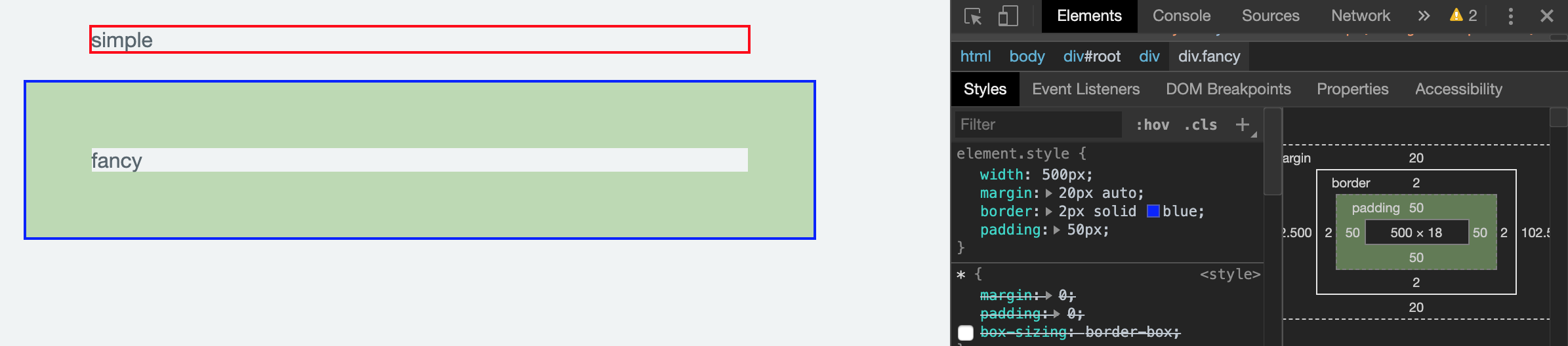
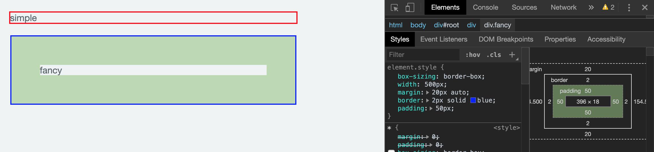
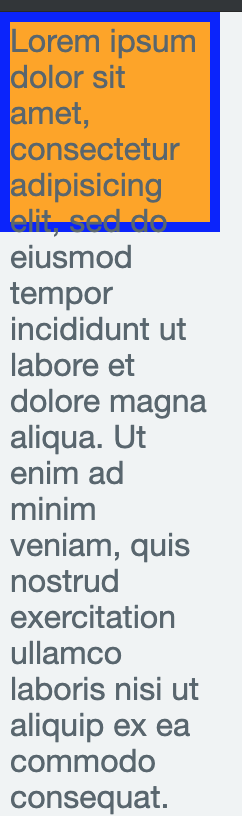
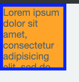
그러면, 다음과 같이 실제 콘텐츠 영역을 숨길 수 있다.

overflow: hidden 적용 후


[2] width와 height의 초기값

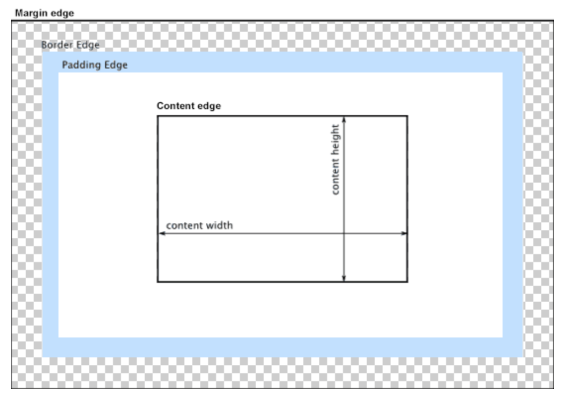
width와 height의 값을 따로 지정하지 않으면, 초기값은 auto로 설정되어, 브라우저가 상황에 따른 width와 height의 값을 계산한다. 요소(element)가 block 요소라면, width는 부모요소의 100%가 되고, height는 콘텐츠의 높이로 계산되어 지정된다.

1
2
3
4
5
6
7
8
9
10
11
12
13
14
15
16
17
18
import React from "react";
import "./App.css";


const divStyle = {
backgroundColor: "orange",
border: "5px solid blue",
};

function App() {
return (
<div style={divStyle}>
hello
</div>
);
}

export default App;

그러면, 다음과 같이 해당 요소의 width는 부모요소인 body의 100%이고, height는 콘텐츠의 높이다.

width와 height의 초기값


[3] 해당 요소의 width가 브라우저의 width 보다 커서 스크롤바가 생기는 경우

1
2
3
4
5
6
7
8
9
10
11
12
13
14
15
16
17
18
19
20
21
22
23
24
25
import React from "react";
import "./App.css";


const divStyle = {
border: "5px solid red",
width: "600px",
margin: "0 auto"
};

function App() {
return (
<div style={divStyle}>
Lorem ipsum dolor sit amet, consectetur adipiscing elit, sed do eiusmod
tempor incididunt ut labore et dolore magna aliqua. Ut enim ad minim
veniam, quis nostrud exercitation ullamco laboris nisi ut aliquip ex ea
commodo consequat. Duis aute irure dolor in reprehenderit in voluptate
velit esse cillum dolore eu fugiat nulla pariatur. Excepteur sint occaecat
cupidatat non proident, sunt in culpa qui officia deserunt mollit anim id
est laborum.
</div>
);
}

export default App;

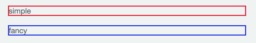
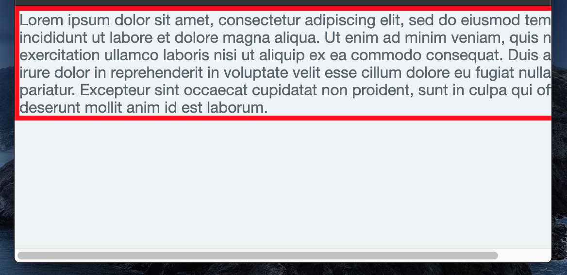
그러면, 다음과 같이 브라우저 width가 해당요소의 width 보다 작을 경우, 화면 아래 가로 스크롤바가 생긴다.

해당 요소의 width가 브라우저의 width 보다 클 경우


1
2
3
4
5
6
7
8
9
10
11
12
13
14
15
16
17
18
19
20
21
22
23
24
25
import React from "react";
import "./App.css";


const divStyle = {
border: "5px solid red",
maxWidth: "600px", // max-width 적용(inline style 경우, max-width -> maxWidth 적용)
margin: "0 auto"
};

function App() {
return (
<div style={divStyle}>
Lorem ipsum dolor sit amet, consectetur adipiscing elit, sed do eiusmod
tempor incididunt ut labore et dolore magna aliqua. Ut enim ad minim
veniam, quis nostrud exercitation ullamco laboris nisi ut aliquip ex ea
commodo consequat. Duis aute irure dolor in reprehenderit in voluptate
velit esse cillum dolore eu fugiat nulla pariatur. Excepteur sint occaecat
cupidatat non proident, sunt in culpa qui officia deserunt mollit anim id
est laborum.
</div>
);
}

export default App;

그러면, 다음과 같이 가로 스크롤바가 생기지 않는다.

max-width 적용 후